


When a label becomes a treasure map
Pick up your closest Planteray bottle. Look at it for a few seconds… then really look.
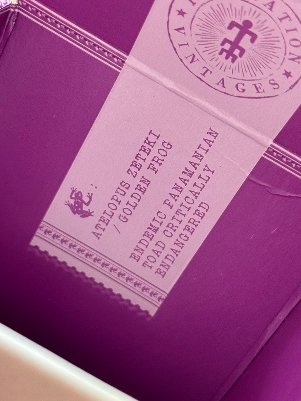
There’s often a detail that slips past at first glance: an animal. Tucked into a frieze, stamped subtly near the ABV, woven into a tiny icon within the illustration. Sometimes, it only reveals itself inside the top of the box.
That animal is never there by accident.
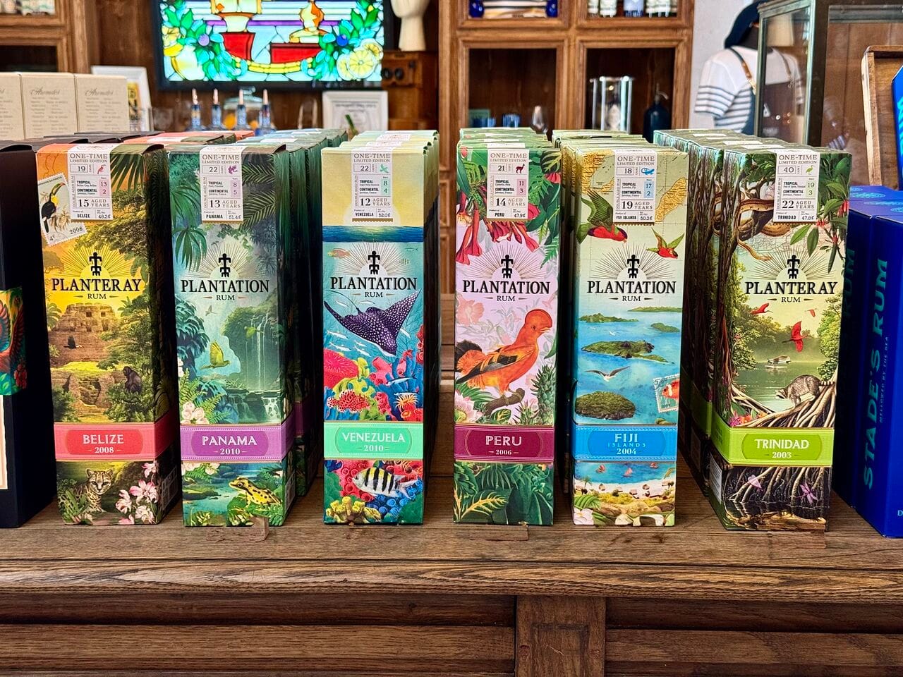
At Planteray, packaging is designed as a window into the great terroirs of rum. A bottle should let you recognize its origin almost instinctively, whether it’s Barbados, Jamaica, Fiji, or Belize and its toucan, without repeating the same imagery across our different releases.
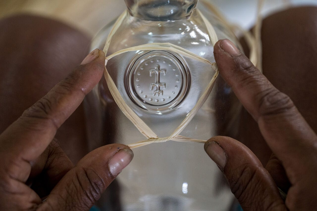
The idea isn’t to simply create a label, but to create a visual language – icons and references that help build the imagery and terroir deeper in your mind. The bright colors inspired by tropical landscapes, the raffia wrapped around the bottle, the elegant silhouette of the bottle… Everything works together to spark a sense of travel and discovery. Then come the details, the ones you discover when you take the time to look.
“I like to think of our packaging like cereal boxes,” says Alexandre Gabriel with a smile.
“First, there’s the quick glance, the moment of purchase, when the bottle catches your eye. Then comes a second, more intimate moment: you sit down, pour yourself a glass, look at the bottle again, and discover something new. A detail, a symbol, a hidden story. Good packaging should keep revealing itself.”
Subtle symbols that tell the story of a place
Each terroir has its signature animal, sometimes paired with a color, like the iguana and blue for Fiji. These choices always draw on a real connection to the land, its wildlife, its landscape, or its history. At Planteray, the goal isn’t to invent a fantasy, but to bring a real place to life visually. These signs don’t always take center stage.
On some Barbados bottles, for instance, the pelican, associated with the island, might be nestled into the patterns or appear in miniature near a detail on the label.
This choice is far from random: it’s rooted in a very real story. Long a symbol of the island, the pelican has become increasingly rare there. Yet this very bird once flew above the distillery and could be spotted from Andrew Hassell, the Distillery Managers office, believed to be one of the last pelicans on the island… That’s why Planteray chose the pelican as one of its symbols for Barbados, as a tribute to the bird itself.
“When designing Planteray packaging, we practically became naturalists. Each terroir led us deeper into its wildlife, flora, and fauna. To create an accurate label, you first must understand the ecosystem it comes from.” - Pierre, Packaging & Design Director
Some collections even play with this idea. With our Under the Sea collection, the signature animal may reveal itself inside the box, alongside its name and its connection to the land. Looking at the bottle becomes almost a game.
Nature rooted in terroir
The landscapes depicted on the packaging aren’t imaginary. The plants, flowers, and animals illustrated are chosen for their real connection to the places they evoke.
The vegetation adds a second layer of storytelling to the labels. On some Barbados bottlings, you can spot the Pride of Barbados, the island’s emblematic flower. In Jamaica, around the hummingbird on Xaymaca and its signature red, you’ll find patterns inspired by hibiscus.
Even when the scenes become more narrative, the intent remains the same: to evoke a real, identifiable environment.
The Terra Vera Collection takes this approach further by also incorporating species commonly found locally, monkeys, snakes, or even raccoons, that help tell the story of these landscapes.
Scenes to explore
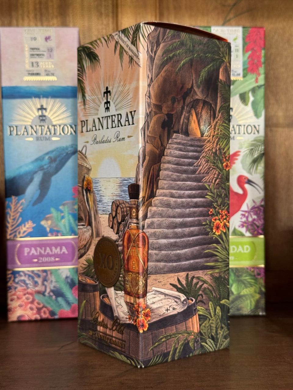
On the Planteray XO 20th anniversary box, the illustration hints at a Barbados secret. You can make out an iconic still, the Old Gregg, dating from 1850, along with the casks that recall double aging, a time-honored signature of Planteray Rum. The illustration becomes an invitation: a hidden place you uncover as you linger over the bottle and sip from your glass…
The journey, down to the materials
The story continues in the materials themselves. The raffia wrapped around each bottle recalls a real piece of history. In an era when bottles traveled freely, bumping and jostling along the roads, they needed protection. To prevent breakage, someone came up with a simple yet ingenious solution to keep them safe along the way, wrap them in this natural recyclable material and thus our iconic look was born.
By keeping this tradition alive, Planteray honors a practice directly tied to the history of rum. Harvested in Madagascar and woven by hand, this raffia now sustains an entire village and has become a powerful, instantly recognizable symbol of the brand. A dedicated article dives deeper into its story, its production, and the craftsmanship behind it.
You can simply pick up the bottle… or take the time to explore it, like a map filled with signs and details. And sometimes, by looking a little more closely, you realize that a simple label can tell an entire story.
This first article was just an invitation to look at Maison Ferrand’s labels differently. Next up, we set course for the world of Citadelle, France’s first gin.


Member discussion